Why Do We Plot Functions in Data Science?
In data science, numbers alone don’t reveal the full story. A table of data might tell us what values exist, but plotting shows us how they behave together.
When we plot two variables, we can instantly see how one affects the other.
- For example, plotting study hours vs. exam scores shows a straight upward line → more hours studied, higher scores.
- Without a plot, you just have random numbers. With a plot, you clearly see the relationship.
Before applying a mathematical model, we must know the data’s “shape”.
- If the points form a straight line, linear regression might work.
- If they form a curve, we may need polynomial or non-linear models.
- If the points are scattered without a pattern, maybe a different approach (like clustering) is required.
Types of Functions and Their Uses in Data Science
Different mathematical functions are used for various types of patterns. Every kind of function helps us explain, predict, and make better decisions based on data.
Common functions used in data science include:
1) Linear Functions: This function represents simple and straight-line relationships between two variables. It is also predicting outcomes with linear regression and quick baseline models because they are easy to interpret.
2) Quadratic Functions: This also works with a squared variable, giving a U-shaped (parabola) curve. It’s useful when data first increases and then decreases.
3) Exponential Functions: It’s Useful for data with rapid growth or decay, like population growth, viral spread, or radioactive decay. This function is used in machine learning for activation functions.
4) Logarithmic Functions: This is the inverse of exponential functions. It means Growth is fast at the start and then slows down. It’s used in algorithms for feature scaling and information gain in decision trees.
Plotting Different Types of Functions in Data Science
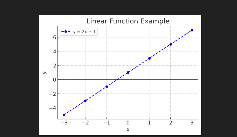
A) Plotting a Linear Function
Linear functions are straightforward and represented by the equation y=mx+b, where m is the slope and b is the intercept.
Example: Linear Function
Consider a simple linear function y=2x+1.
Python Code:
import numpy as np
import matplotlib.pyplot as plt

# x values
x = np.array([-3, -2, -1, 0, 1, 2, 3])
# Linear function: y = 2x + 1
y = 2 * x + 1

plt.figure(figsize=(6,4))
plt.plot(x, y, marker="o", color="blue", linestyle="--", label="y = 2x + 1")
plt.title("Linear Function Example")
plt.xlabel("x")
plt.ylabel("y")
plt.axhline(0, color="black", linewidth=0.5)  # x-axis
plt.axvline(0, color="black", linewidth=0.5)  # y-axis
plt.grid(True)
plt.legend()
plt.show()
Output:
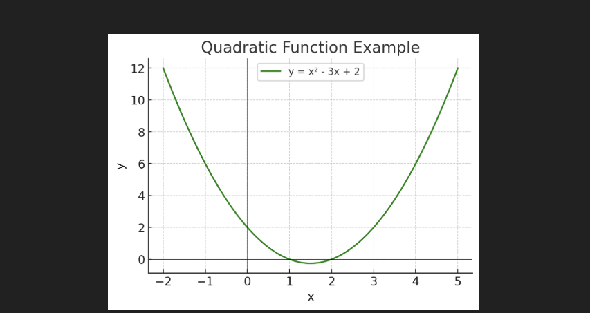
B. Plotting a Quadratic Function
A quadratic function is represented by y=ax2+bx+c and forms a parabolic curve. These functions are useful for modelling relationships where the rate of change increases or decreases.
Example: Quadratic Function
Equation: y=x2−3x+2.
Python Code:
# Quadratic function example
x = np.linspace(-2, 5, 100)
y = x**2 - 3*x + 2

plt.figure(figsize=(6,4))
plt.plot(x, y, color="green", label="y = x² - 3x + 2")
plt.title("Quadratic Function Example")
plt.xlabel("x")
plt.ylabel("y")
plt.axhline(0, color="black", linewidth=0.5)
plt.axvline(0, color="black", linewidth=0.5)
plt.grid(True)
plt.legend()
plt.show()
Output:
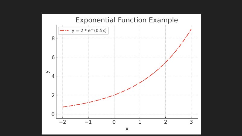
C. Plotting an Exponential Function
Exponential functions are represented by y=a⋅ebx, where e is Euler’s number (approximately 2.718).
Example: Exponential Function
Equation: y = 2 * e^(0.5x)
Python Code:
# Exponential function example
x = np.linspace(-2, 3, 100)
y = 2 * np.exp(0.5 * x)

plt.figure(figsize=(6,4))
plt.plot(x, y, color="red", linestyle="-.", label="y = 2 * e^(0.5x)")
plt.title("Exponential Function Example")
plt.xlabel("x")
plt.ylabel("y")
plt.axhline(0, color="black", linewidth=0.5)
plt.axvline(0, color="black", linewidth=0.5)
plt.grid(True)
plt.legend()
plt.show()
Output:
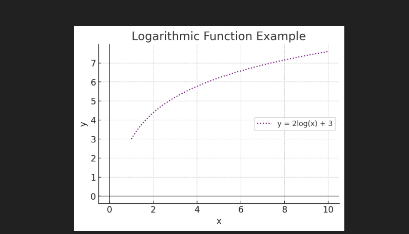
D. Plotting a Logarithmic Function
Logarithmic functions represented as y=a⋅log(x)+b.
Example: Logarithmic Function
Equation: y=2⋅log(x)+3.
Python Code:
# Logarithmic function example
x = np.linspace(1, 10, 100)   # log(x) undefined for x <= 0
y = 2 * np.log(x) + 3

plt.figure(figsize=(6,4))
plt.plot(x, y, color="purple", linestyle=":", label="y = 2log(x) + 3")
plt.title("Logarithmic Function Example")
plt.xlabel("x")
plt.ylabel("y")
plt.axhline(0, color="black", linewidth=0.5)
plt.axvline(0, color="black", linewidth=0.5)
plt.grid(True)
plt.legend()
plt.show()
Output:
Simple Exercise For Students
“A fruit seller’s earnings”
A fruit seller sells apples at ₹20 per apple. He also charges a fixed delivery fee of ₹50 (regardless of how many apples are bought).
Write a Python program to plot the total cost (y) as a function of the number of apples (x).
- Allow x to vary from 0 to 10.
- Plot the graph and observe whether it is a straight line or a curve.
- From the graph, explain:
- How the fixed cost affects the graph.
- Why is the slope of the line ₹20?
This exercise looks simple, but here students can easily understand how linear graphs are combined in a real-life project.
Learn More About Data Science
- What is data in data science?
- What is a database table in data science?
- How to use Python in data science?
- Python DataFrame in data science?
- What are the functions in data science?

M.Sc. (Information Technology). I explain AI, AGI, Programming and future technologies in simple language. Founder of BoxOfLearn.com.