What is a Percentile?
A percentile is a number that tells us what percentage of data values fall below a given point in the dataset.
- If you are in the 70th percentile, it means you scored better than 70% of the data points.
- Suppose you are ranking in sports; if you are in the 90th percentile, you are ahead of 90% of the runners.
Key Percentiles We Should Know
1) 25th Percentile (1st Quartile):
- This is the point where 25% of the data lies below.
- For example, in an exam, if the 25th percentile score is 45, then 25% of students scored less than 45 marks.
2) 50th Percentile (Median):
- This refers to the middle value of the data.
- It means, exactly 50% of values are below it, and 50% are above it.
- For example, if the median salary in a company is ₹40,000, then half of the employees earn less than ₹40,000, and half earn more.
3) 75th Percentile (3rd Quartile): Also known as Q3, the upper quartile below which 75% of the data is found.
- It is also known as Q3, where 75% of the data lies below.
- For example, if Q3 = 70, then 75% of students scored below 70 marks.
Why Are Percentiles Important in Data Science?
- Outline detection: If a value is way above the 95th percentile or way below the 5th percentile, it could be an outlier.
- Understanding distribution: Percentiles show how data spreads, instead of looking at just the average.
- Decision-making: Companies often use percentiles for salaries, scores, and risk analysis.
- Data normalization: In machine learning, percentile-based scaling helps prepare features for models.
Simple Example with Data
Let’s say we have student scores: [20, 35, 40, 50, 55, 60, 70, 80, 90, 95]
- 25th Percentile (Q1): = 40
- 50th Percentile (Median): = 55
- 75th Percentile (Q3): = 80
This means:
- 25% of students scored below 40
- 50% scored below 55
- 75% scored below 80
Python Example (With Output)
import numpy as np

# Student scores
scores = [20, 35, 40, 50, 55, 60, 70, 80, 90, 95]

# Calculate percentiles
q1 = np.percentile(scores, 25)  # 25th percentile
q2 = np.percentile(scores, 50)  # 50th percentile (Median)
q3 = np.percentile(scores, 75)  # 75th percentile

print("25th Percentile (Q1):", q1)
print("50th Percentile (Median, Q2):", q2)
print("75th Percentile (Q3):", q3)
Output:
25th Percentile (Q1): 40.0
50th Percentile (Median, Q2): 55.0
75th Percentile (Q3): 80.0
How Percentiles are Calculated in Statistics (For Data Science)
Percentiles are calculated by sorting the data and identifying the position within that sorted dataset. The general formula for finding the k-th percentile Pk in a dataset of size n is: Pk=k / 100 × (n+1).
There are multiple steps to calculate the percentiles:
Step 1: Sort the Data
First, arrange your dataset in ascending order (from smallest to largest). Percentiles are always calculated from sorted data because we want to know the position of values in the ranking.
Step 2: Use the Formula

Where:
- k → the percentile you want (e.g., 25, 50, 75).
- n → the number of data points.
- Pk → the position of the percentile in the sorted data.
Notice: The formula gives us the position (index) in the dataset, not the actual value yet.
Step 3: Interpret the Position
There are two possible cases:
- Pk is an integer → That exact position in the dataset is your percentile value.
- Pk is not an integer (decimal) → This means the percentile lies between two data points.
- In this case, we interpolate (find a value between those two data points).
Step 4: Interpolation (When Pk is Not an Integer)
- Interpolation means we take a weighted average between the two nearest values.
- For example, if Pk = 4.25, it means the value lies 25% of the way between the 4th and 5th data points.
Formula for interpolation: Percentile Value=Lower Value+(DecimalPart×(UpperValue−LowerValue))
Examples of Percentile Calculations
Suppose we have a dataset: 10,20,30,40,50,60,70,80,90,100.
(Already sorted, size n = 10)
Step 1: Apply the formula

So, the 25th percentile lies between the 2nd and 3rd values.
Step 2: Interpolate
- 2nd value = 20
- 3rd value = 30
- Decimal part = 0.75

25th percentile (Q1) = 27.5; this means that 25% of the data points are below 27.5, and the rest are above.
Example 2: 50th Percentile (Median, Q2)
Step 1: Apply the formula

So, the position is between the 5th and 6th values.
Step 2: Interpolate
- 5th value = 50
- 6th value = 60
- Decimal part = 0.5

50th percentile (Median) = 55; this means that half the values are below 55 and half are above 55.
Example 3 (Unique One): 75th Percentile (Q3)
Step 1: Apply the formula

So, the position is between the 8th and 9th values.
Step 2: Interpolate
- 8th value = 80
- 9th value = 90
- Decimal part = 0.25

75th percentile (Q3) = 82.5; this means that 75% of the data is below 82.5 and only 25% is above it.
Python Example:
import numpy as np

# Dataset
data = [10,20,30,40,50,60,70,80,90,100]

# Calculate percentiles
q1 = np.percentile(data, 25)
q2 = np.percentile(data, 50)  # Median
q3 = np.percentile(data, 75)

print("25th Percentile (Q1):", q1)
print("50th Percentile (Median, Q2):", q2)
print("75th Percentile (Q3):", q3)
Output:
25th Percentile (Q1): 27.5
50th Percentile (Median, Q2): 55.0
75th Percentile (Q3): 82.5
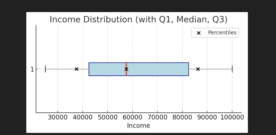
Plotting Percentiles with Code
Percentiles can be visualized using box plots, which show the interquartile range (IQR) and provide a summary of the distribution, including Q1, median (Q2), and Q3.
import numpy as np
import matplotlib.pyplot as plt

# Sample income dataset (in ascending order for clarity)
incomes = [25000, 30000, 40000, 50000, 55000,
           60000, 75000, 85000, 90000, 100000]

# --- Manual calculation style for uniqueness ---
n = len(incomes)

# 25th Percentile (Q1)
pos_q1 = 0.25 * (n + 1)
Q1 = np.interp(pos_q1, range(1, n+1), incomes)

# 50th Percentile (Median)
pos_q2 = 0.50 * (n + 1)
Q2 = np.interp(pos_q2, range(1, n+1), incomes)

# 75th Percentile (Q3)
pos_q3 = 0.75 * (n + 1)
Q3 = np.interp(pos_q3, range(1, n+1), incomes)

# Print results
print(f"Q1 (25th Percentile): {Q1}")
print(f"Q2 (Median, 50th): {Q2}")
print(f"Q3 (75th Percentile): {Q3}")

# --- Visualization ---
plt.figure(figsize=(7,3))
plt.boxplot(incomes, vert=False, patch_artist=True,
            boxprops=dict(facecolor="lightblue", color="navy"),
            medianprops=dict(color="red", linewidth=2),
            whiskerprops=dict(color="gray"))
plt.scatter([Q1, Q2, Q3], [1,1,1], color="black", zorder=3, label="Percentiles")
plt.xlabel("Income")
plt.title("Income Distribution (with Q1, Median, Q3)")
plt.legend()
plt.show()
Output:
Exercise: Visualizing Percentiles in Exam Scores
Problem Statement for Students: A teacher collected exam scores of 20 students. Your task is to:
- Arrange the scores in ascending order.
- Calculate the 25th percentile, 50th percentile (median), and 75th percentile of the dataset.
- Draw a line graph showing the distribution of student scores.
- On the graph, mark and label the three percentile values using horizontal dashed lines.
- Write a short explanation (2–3 lines) about what each percentile means in the context of exam scores.
Learn More About Data Science
- What is data in data science?
- What is a database table in data science?
- How to use Python in data science?
- Python DataFrame in data science?
- What are the functions in data science?

M.Sc. (Information Technology). I explain AI, AGI, Programming and future technologies in simple language. Founder of BoxOfLearn.com.