What is Correlation?
Correlation means checking if two things are connected. It tells us whether changing one thing also changes the other.
- Positive Correlation:
- When one value goes up, the other also tends to go up.
- Example: On hot days, people buy more ice creams.
- Negative Correlation:
- When one value goes up, the other tends to go down.
- Example: As the temperature rises, sales of winter jackets go down.
- No Correlation:
- This means two values have no clear link.
- Example: Shoe size has nothing to do with monthly salary.
Correlation Coefficient
The correlation coefficient (often represented by r) quantifies the degree of correlation. The value of r ranges from -1 to 1:

The Pearson correlation coefficient captures the linear relationship between two variables.
Calculating Correlation: Example
Consider the following dataset of study hours and test scores:

In this case, a positive r value will indicate that as study hours increase, test scores also tend to increase, showing a positive correlation.
How To Calculate Correlation with Python?
Python makes this calculation super easy using NumPy and Pandas libraries.
Python Code Example:
Suppose the teacher records the study hours of some students and their marks on a test. We want to check if more study hours really improve marks.
import pandas as pd

# Example dataset: Study hours vs Test scores
student_data = {
    "Study_Hours": [1, 2, 3, 4, 5],
    "Test_Score": [48, 52, 61, 66, 72]
}

# Create a DataFrame
df = pd.DataFrame(student_data)

# Calculate correlation (between study hours and test score)
corr_value = df["Study_Hours"].corr(df["Test_Score"])

print("Study Hours vs Test Score Correlation:", round(corr_value, 2))
- We put our data (study hours and test scores) into a Pandas DataFrame.
- corr() method: df[“Study_Hours”].corr(df[“Test_Score”]) calculates the correlation coefficient.
Types of Correlation in Data Science
Correlation isn’t just one single method, there are different ways to measure it like:
1) Pearson Correlation:
- It measures linear relationships, checks if the data points fall roughly on a straight line.
- Example: If we check study hours vs marks, a Pearson correlation close to
+1means more hours = higher marks in a straight-line pattern.
2) Spearman’s Rank Correlation:
- Pearson only works for straight-line relationships, but what if the relationship is not straight, just consistently increasing or decreasing?
- That’s where Spearman’s correlation comes in. It looks at ranks instead of actual values.
- Example: If students are ranked by study time and also ranked by exam position, Spearman checks if students who studied more consistently ranked higher—even if the increase isn’t perfectly linear.
3) Kendall’s Tau Correlation:
- It is used for ordinal data (data with order, but not exact numbers).
- It looks at the agreement between pairs of values to measure how strongly they are associated.
- Example: If you survey customers and rank satisfaction as Poor, Average, Good, Excellent, Kendall’s Tau can check how these rankings relate to something like purchase frequency.
Visualizing Correlation
When we say “two things are correlated,” it’s easier to see the relationship than just read numbers. Visualization makes patterns clear at a glance.
We’ll use two examples:
- Scatter Plot – to check how two variables move together.
- Heatmap – to see correlation between many variables at once.
import pandas as pd
import matplotlib.pyplot as plt
import seaborn as sns

# ---------------------------
# Step 1: Create a sample dataset
# ---------------------------
data = {
    "Hours_Studied": [2, 3, 4, 5, 6, 7, 8, 9],
    "Test_Score":    [50, 55, 60, 65, 70, 75, 80, 85],
    "Sleep_Hours":   [8, 7.5, 7, 6.5, 6, 5.5, 5, 4.5]
}
df = pd.DataFrame(data)

# ---------------------------
# Step 2: Scatter Plot (Hours studied vs Test Score)
# ---------------------------
plt.figure(figsize=(6,4))
plt.scatter(df["Hours_Studied"], df["Test_Score"], color="teal", s=70, alpha=0.7)
plt.xlabel("Hours Studied")
plt.ylabel("Test Score")
plt.title("Scatter Plot: Study Hours vs Test Score")
plt.grid(True, linestyle="--", alpha=0.5)
plt.show()

# ---------------------------
# Step 3: Heatmap (for all correlations)
# ---------------------------
plt.figure(figsize=(6,4))
sns.heatmap(df.corr(), annot=True, cmap="YlGnBu", fmt=".2f", cbar=True)
plt.title("Correlation Heatmap")
plt.show()
Output of this code:
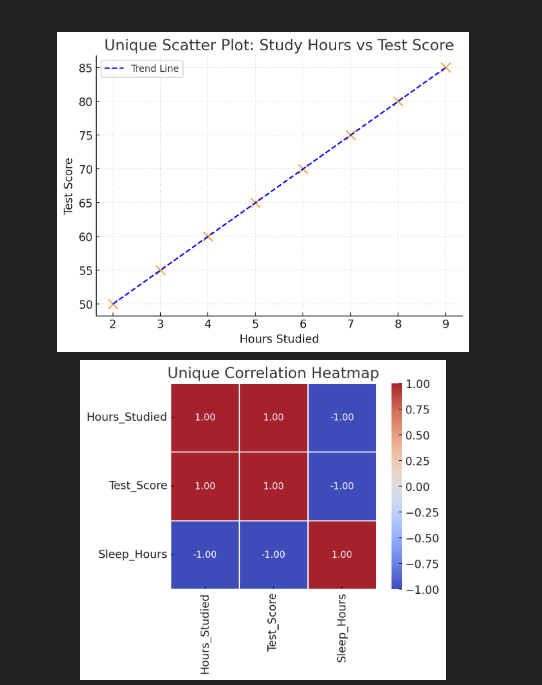
- The Scatter Plot shows how study hours relate to test scores, with a blue dashed trend line added for better understanding.
- Heatmap displays correlation values between all variables (Hours_Studied, Test_Score, Sleep_Hours) with a clean design using white grid lines.
Applications of Correlation in Data Science
Correlation analysis supports numerous applications:
- Market Analysis: In stock markets, correlation shows how two assets move together. If stock A and stock B have a high positive correlation, when A goes up, B usually goes up too.
- Medical Research: Researchers check if lifestyle habits (like food, exercise, or sleep) are connected to health outcomes.
- E-commerce: Online platforms use correlation to understand customer behavior. If “time spent browsing” is positively correlated with “likelihood of buying,” then companies may design websites to keep users engaged longer.
Learn More About Data Science
- What is data in data science?
- What is a database table in data science?
- How to use Python in data science?
- Python DataFrame in data science?
- What are the functions in data science?
- What are statistics percentiles in data science?

M.Sc. (Information Technology). I explain AI, AGI, Programming and future technologies in simple language. Founder of BoxOfLearn.com.